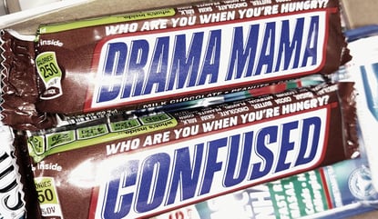
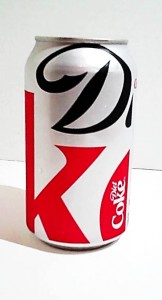
Reviewing new logo treatments, we were presented with a page of logos looking as if they were behind frosted glass. The page’s title was the “Squint Test.” The point is a strong logo should be so distinct that it’s clear and recognizable even if it’s not seen clearly, i.e. you’re squinting at it.
The concept is related to previous posts on CBR (the rules of “Can’t Be Right”) and extends beyond graphics as a good test for any new concept under consideration.
Think about factors that might obscure your concept’s clarity, impact, and success upon implementation. Will the factors be:

- Visual?
- Auditory?
- Related to lack of knowledge?
- Due to misinformation?
- From too small or narrow an audience?
- Mismatched technology?
- Insufficient resources?
- Or something else?
Figure out the relevant factors and apply (or approximate) them to see how well your concept works when it’s in real-life, far from ideal situations (such as when a tree falls through the neighbor's roof as in the picture here).
Reminder - Follow me on Twitter!


