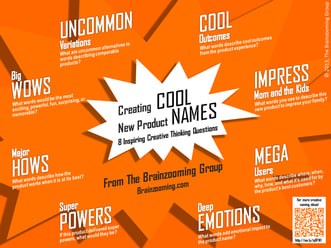
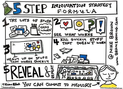
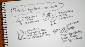
 Some time back, Jorma Lehtinen (@Notium) reached out on Twitter about software he uses to visualize data, sharing a visualization of a Brainzooming blog list post as an example. We also tweeted about the importance of underlying information design when it comes to how to make an infographic.
Jorma's outreach along with Woody Bendle's article on visual thinking about calorie data prompted publishing this post on problems (and opportunities) associated with infographics.
Infographics are all the rage in social media.
So many of them, however, don't deliver very much.
They are simply "pretty" pictures over-loaded with all the descriptive text that would be there even without the visual treatment. At the same time, they often obscure or eliminate details needed to make sound assessments on the validity of the underlying data and the conclusions the infographic suggests.
How to Make an Infographic Deliver Visual Thinking Value
Here are eight ways strong visualizations and infographics can deliver value by providing a richer data and analysis experience than the prose they are (or should be) replacing. Not all eight have to be in place, but at least a number of them should be.
Strong visualizations and infographics should:
1. Allow you to convey information more simply
The visual should deliver information at a minimum rate of 500 words per image. It would be great, however, if an infographic were legitimately worth a thousand words. If your image requires too many labels text for explanation, there is more work to do.
2. Make processing information quicker and more efficient
Any visuals should allow the audience to take in, understand, analyze, and draw conclusions with greater efficiency. There shouldn't be so much detail that it becomes even more cumbersome for a reader to look at an infographic instead of reading prose.
3. Reveal new relationships
Visuals should really shine in highlighting relationships between data that would be lost with prose alone. As a shining example, consider the graphic of Napoleon's army Edward Tufte has popularized. The visual depicts multiple time, geography, resource, and strategy relationships words alone could never convey.
4. Balance space efficiency and effectiveness
Having attended an Edward Tufte class, a big takeaway was paying attention to information density. Strong visualizations and infographics should pack a disproportionate amount of information into the space occupied. There is a balance though - with too much detail, key points are obscured; with too little detail, the audience doesn't get the impact of text alone.
5. Offer greater clarity and accuracy
It can be difficult with only words to reveal subtle differences in data. A visual can work much harder to suggest patterns, similarities, and differences with a precision words can't attain. But as the book How to Lie with Charts (affiliate link) screams out, it's also easy to mislead your audience with visuals. Caveat audience AND the caveat designer.
6. Generate more possibilities
A rich visual triggers audience members to envision even more new ideas, solutions, or relationships to examine. If a viewer can look at a visual and quickly move on without new thinking taking place, there's either a problem with the visual or the underlying information.
7. Lead to faster prototyping of ideas, concepts, strategies
Especially with abstract areas, strong visualization should convey a less than completely formed concept more rapidly than explaining it or taking time to physically construct the concept, if that's even possible. Being able to quickly sketch an abstract concept allows it to move forward and develop with greater speed.
8. Do a better job of making information palatable to consume
Call this the "Spoonful of Sugar" phenomenon. If you hit a reader with a long, convoluted prose description of data or tabular information, you may never convey key insights, conclusions, or recommendations. A visual, especially with challenging information, should be an open door to initially bring a reader into the data, with a suggested path to explore even deeper levels.
What do you think is important when it comes to how to make an infographic ?
Perhaps not surprisingly, many of these criteria for how to make an infographic deliver visual thinking value relate closely to the old maxim about a picture being worth a thousand words. So since this post is over 700 words, I’m looking for an infographic operating at about 75% to blow it out of the water. Any takers? – Mike Brown


