Are your innovation and creativity efforts too focused on new products? Do you spend too much time adding bells and whistles, trying to be the next new thing? Could you have more positive impact focusing on making current products (or services) easier to use, safer, or less expensive? Is enhancing the current user experience a bad thing?
Why Isn't It Working Properly?
In the book, Free Flight, James Fallows showed that in case after case what had been called pilot error was, in fact, a problem with the design or manufacture of the aircraft. But everything was sloughed off to “operator error” and not enough was being done to fix those problems or look at them in that context. The emphasis was on “new and fancier,” not fixing what was systemically done wrong in the past.
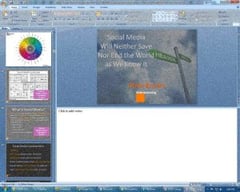
 During a recent weekend I saw two such instances of “operator error.” I went to two events that featured speaker presentations. At each a speaker used PowerPoint to make her presentation and it was in “normal” rather than “slide show” mode. The first time, it was distracting, but didn’t make a lot of difference. The presentation was essentially a brochure transferred to overheads. There wasn’t much suspense in the presentation and being able to see what the next slide was going to be wasn’t a big deal.
The second time, however, it really detracted. The topic was how to choose colors for the exterior of a house—walls, trim, roof, accessories. The presenter was at a large “home and garden” show, she had written a book on the subject and at least part of her goal in the presentation was to sell that book.
With PowerPoint in normal mode she was showing images that were about one-half size of what they could/should have been. She kept saying things like, “If the picture were bigger you could see that this trim really picks up the color of the flowers . . .” Plus, she had some before and after pictures, but because we could see what the next slide was going to be, none of the “afters” provided much in the way of surprise or impact.
What's the Matter with PowerPoint?
Both of these presenters should have known better. Certainly the woman selling the book should have. But why is PowerPoint so “feature” rich and complex to use that it isn’t clear when you are using it wrong? Each version adds additional options, new menus, and moves things around. But that often occurs at the expense of what were solid, dependable ways of doing what you want to do.
Microsoft is a powerful source of creativity and innovation, but for the next version of Office I would be happy if they would focus on making it easier, simpler, and more dependable rather than “better.” – Barrett Sydnor
The Brainzooming Group helps make smart organizations more successful by rapidly expanding their strategic options and creating innovative plans they can efficiently implement. Email us atbrainzooming@gmail.com or call us at 816-509-5320 to learn how we can deliver these benefits for you.


