Think about the common, albeit under-followed, presentation tips for speakers who want to deliver content more effectively:
- Use more and bigger images to engage the audience visually
- Don't include everything you're going to say on the slides
- Use high-contrast foreground and background colors to improve readability
- Make ample use of builds to keep the audience from getting ahead of what you are saying
I preach and try to follow these presentation tips whenever I speak.
Do Traditional Presentation Tips Still Apply?
Yet, at three recent seminars I covered (including ones from Walmart and IKEA), these traditional presentation tips were blatantly ignored by three high-profile presenters.
 Their slides were loaded with text and more detail than I had seen on slides in “good” presentations in ages. Usually when a speaker uses that much text on slides, I figure the presenter threw the slides together at the last minute and simply typed up whatever he or she was planning to say.
That was not what was going on in any of these presentations, though.
Instead, my own interaction with the content indicated a potential change in thinking on presentation slides.
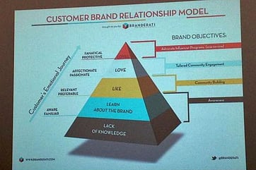
Rather than simply typing live tweets of the speaker’s remarks, I was taking photos of the slides - some of which I was tweeting while capturing othrs for later reference (including writing a blog post from photos of Chad Mitchell’s slides). This phenomenon, coupled with how people are increasingly taking picture of more detailed slides at my own presentations suggests we are entering the era of creating photogenic slides for presentations.
If this is a trend, traditional presentation tips for constructing slides as visual support begin to shift.
In these three instances, the slides provided the most detailed content each speaker offered since none provided hard copy documentation. If you wanted the details, your best option was to start taking photos, diverting your attention from the speaker’s live content.
Presentation Tips for Creating Photogenic Slides
If we are in the age of creating photogenic slides, what are the new success factors for strong presentations?
 From these early examples and my own experience, here are five critical success factors to consider when creating photogenic slides:
- Use high-density text - If the slides are intended for later consumption, it suddenly makes sense to include as much detail as possible to address detail and questions the audience will want to review afterward.
- Incorporate online references - Rather than simply embedding a video, featuring a graphic, or telling a story, it becomes more valuable for later viewing to have a link on the slide for an audience member to reach the underlying content afterward.
- Detailed, over-complicated infographics - Process diagrams and slides with incredible detail become feasible, even desirable - as long as the detail is not so small it is lost when the audience later zooms in to review specific items.
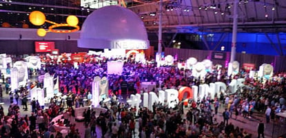
- Less radical light/dark shifts between the room and the slides - At the session depicted in this photo, the room and stage were dark (except for focused lighting on the speakers) and the slides were light, creating a jarring contrast for photos. If you are aiming for photogenic slides, inquire ahead about the staging and adjust the color and contrast of your slides accordingly.
- More screen time for slides with mega-content - While builds work to keep the audience with the speaker, they are maddening when taking photos of slides. The answer either is fewer build slides or, if you are using builds, allowing time for a photo once all the content is displayed instead of moving briskly to the next slide.
Are you taking more photos of slides during presentations? And when you are presenting, are you thinking about creating photogeneic slides? In either case, what critical success factors would you add to this list? - Mike Brown


